Gray Font: A Display Typeface for Urban Digital Identity
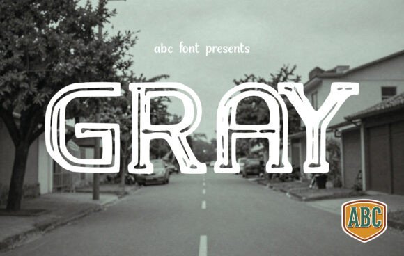
As a UI designer who ships dozens of landing pages, SaaS dashboards, and e-commerce experiences each year, I reach for Gray when the brand needs to feel grounded, intentional, and quietly confident—not loud, not trendy, but unmistakably human-made. Gray isn’t a neutral fallback. It’s a deliberate choice: a display typeface built from double-line structures that echo technical pen sketches on vintage city maps. That visual DNA translates directly into digital clarity—especially where tone and texture matter as much as legibility.
In practice, Gray excels in high-impact, short-form contexts. Think hero section headlines over gradient overlays, product name treatments in online store banners, or section headers on course sales pages where you need immediate recognition without visual noise. Its outlined geometry creates natural separation from backgrounds—whether it’s a dark-mode app interface or a light-textured photography site. Because the strokes are open and rhythmic—not tightly kerned or overly condensed—it breathes well on mobile viewports, even at 32px on a 375px-wide screen.
Gray is not intended for body copy. It’s a display font, designed for emphasis, not endurance. Use it for short phrases only: “Built for Creators,” “New York • Berlin • Tokyo,” “Launch Week.” Its structure supports visual hierarchy by creating instant contrast against clean sans serif body fonts like Inter, Manrope, or even system stacks (SF Pro, Segoe UI). That contrast doesn’t shout—it guides. Users scan faster because Gray anchors meaning before they read the sentence.
For branding consistency, Gray works especially well when paired with a restrained sans serif. Try it with a medium-weight sans for subheadings and a lighter weight for captions. That trio—Gray for primary headline, medium sans for secondary, light sans for supporting text—builds rhythm across layouts: portfolio case studies, blog headers, email campaign banners, even animated SVG text in Figma prototypes. On a coaching website, Gray sets the tone for authenticity (“Clarity, Not Clutter”) while the body font handles empathy-driven copy without competing.
It also performs reliably across background conditions. Over muted photography? The outline gives it lift. On solid dark mode backgrounds? No fill-to-outline bleed—its stroke weight holds. On light backgrounds with subtle noise textures? The dual lines catch ambient light just enough to avoid flatness. Just avoid using Gray below 24px on desktop or 20px on mobile—even with optimized webfont loading, its detail begins to soften at smaller sizes.
For digital product teams, Gray integrates cleanly into design systems. Most licensed versions include WOFF2 files optimized for fast load times, basic Latin character sets, and OpenType features like stylistic alternates (useful for logo lockups or social media avatars). It’s not a multilingual powerhouse—no Cyrillic or extended diacritics—but covers English, Spanish, French, German, and Dutch with full punctuation and numerals. If your audience is global, pair Gray with a robust web-safe fallback in your CSS stack.
Pairing matters. Gray leans industrial but not cold. Avoid clashing it with geometric extremes (like Futura Bold) or ornate serifs. Instead, try it alongside a warm, low-contrast serif like Literata or a relaxed neo-grotesque like Poppins Light. For editorial-style blogs or creative agency sites, that combo signals craft and credibility. For a boutique online store selling handmade ceramics or analog tools? Gray + a soft sans like Lato Regular delivers tactile warmth without sacrificing precision.
Where Gray shines most is in conversion-focused layouts. On a product landing page, a Gray headline above a CTA button (“Reserve Your Spot”) adds authority without aggression. In an email header for a limited-time offer, its sketch-like honesty builds trust faster than a glossy, over-rendered script font ever could. And for designers building reusable Figma kits or Shopify theme assets? Gray’s distinct silhouette makes it instantly recognizable across mockups, client presentations, and live previews—strengthening your own brand as a thoughtful, detail-oriented creator.
Licensing is straightforward but essential to address. Gray is a commercial font—meaning it requires a license for any public-facing use: websites, client projects, digital templates, or branded assets distributed beyond personal use. Most vendors offer perpetual licenses with web embedding rights (including unlimited pageviews), and many include desktop use for design work. Always verify whether your license covers SaaS platforms, e-commerce integrations (like Shopify or Webflow), or template marketplaces—some tiers restrict redistribution. When in doubt, choose the extended license. It’s cheaper than a redesign after a DMCA notice.
Real-world examples help ground this: A freelance illustrator uses Gray for her portfolio site’s main headline (“Drawn in Brooklyn”) over a grainy cityscape photo—clean, memorable, platform-agnostic. A sustainable skincare brand applies Gray to product category banners (“Cleansers • Toners • Serums”) inside their online shop, then switches to a breathable sans for ingredient lists and usage instructions. A fintech startup testing a new dashboard uses Gray only for the top-level navigation label (“Insights”), keeping all other UI text in a functional system font—creating focus without friction.
Gray won’t solve every typographic challenge. It won’t replace your body font. It won’t magically fix weak hierarchy or poor spacing. But when used intentionally—as a display typeface that carries urban texture, technical precision, and quiet confidence—it becomes a consistent signal across every digital touchpoint. It tells users, before they scroll or click, that this experience was made with care, not automation. And in today’s saturated digital landscape, that distinction isn’t decorative. It’s functional.